bauerhorst
UX UI Designer & Director
CASE STUDY
Nymbus Banking Transfer Flow
Role:
Product Designer
Other Product Designers: Julio Camey & Ximena Godinez
Background:
Nymbus provides a suite of banking products, retail and business banking, to mostly Credit Unions. They also develop custom digital banks and niche banking.
Objective:
Our customers experienced user frustration with the current banking transfer flow, as it took users too long to make a single transfer. What should have been a quick and intuitive banking flow caused a lot of friction.
Strategy:
User research, competitive analysis, redesign, user testing, go live, gather feedback, improve if needed

Previous Transfer Flow:
Users have to interact with each item on the screen, besides setting a memo and the recurring transfer is optional.
Every time the user starts a task they are taking to another screen to complete the task.
Empathy Map
Current flow
Users get frustrated with the multiple screens and having to continue to hit confirmation buttons.
The time it takes to complete a single transfer is also too long.
Competitive Research:
We conducted competitive research by reviewing the transfer flows of other major banks as well
non banking related mobile apps such as Instacart, because of their modern UX of using cards
instead of progressing from page to page.
We also used a website called: https://fintech-insights.com/ to compare ux results of the transfer flows of other banks. https://fintech-insights.com/ user tests bank’s user experiences from banking applications world wide. To our surprise Bank of America scored some of the lowest for their transfer flow and Result, a new digital bank, scored the best.

To our surprise Bank of America scored some of the lowest for their transfer flow
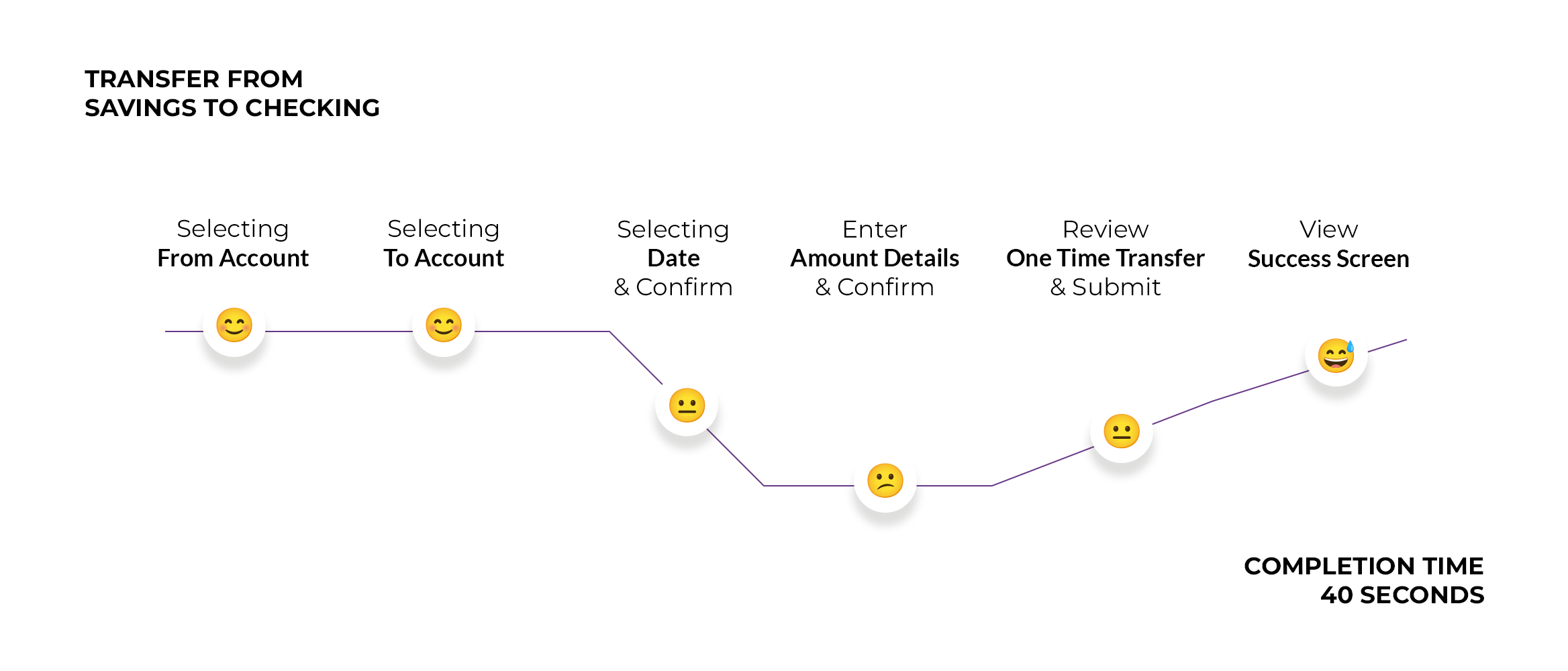
User Testing:
We user tested the previous flow in a moderated user test with 6 people.
UX Test Question:
”Complete a one-time transfer.”
100% of testers were able to complete the transfer.
It took the users about 40 seconds to complete the transfer.
We could see that they had to refocus each time they landed on the original transfer screen,
to find where they have to touch next.
“How often do you create a recurring transfer?”
5 out of 6 answered rarely or never.
Feedback from testers:
”It feels a bit outdated.”
”It was easy to complete the transfer.”
”I usually transfer on the same day, maybe defaulting to today, so I don’t have to go in and change the date, would be nice.”
Results weren’t really too bad, but we thought we could improve the user experience and make it a lot faster. 40 seconds duration to complete a single transfer was what really stood out to us.
Solution:
To reduce the time, we wanted to have the user do every task inline, without taking them away
from their transfer screen, where they started. So they could perform each task in context and
wouldn’t have to refocus every time they land back on the screen. We also defaulted the date
to “today” and auto advanced them from the selection of the “From Account” to the selection
of the “To Account”.
”It feels a bit outdated.”
User feedback
”It was easy to complete the transfer.”
User feedback

New Suggested
Transfer Flow Chart:

New Suggested
Transfer Flow Design:
A/B User Test:
After our redesign of the transfer flow, we ended up with two design solutions.
In order to validate which solution was most preferred by our users we conducted an A/B Test.
Role:
Product Designer and User Tester
Other Product Designer and User Tester: Taylor Godsey
A/B Test Prototypes
Test A: Uses single screen approach
Test B: Uses guided, dedicated card approach
A/B User Test Results:
7 out of 10 testers preferred the single screen approach, because all of the actions were performed on a single screen, in line and in context. Speed improved by 32.5% and we omitted 10 screens.


What can be improved?
Creating a more clear communicating “Transfer Icon”
Adding a prompt to inform the user to review everything before hitting submit