bauerhorst
UX UI Designer & Director
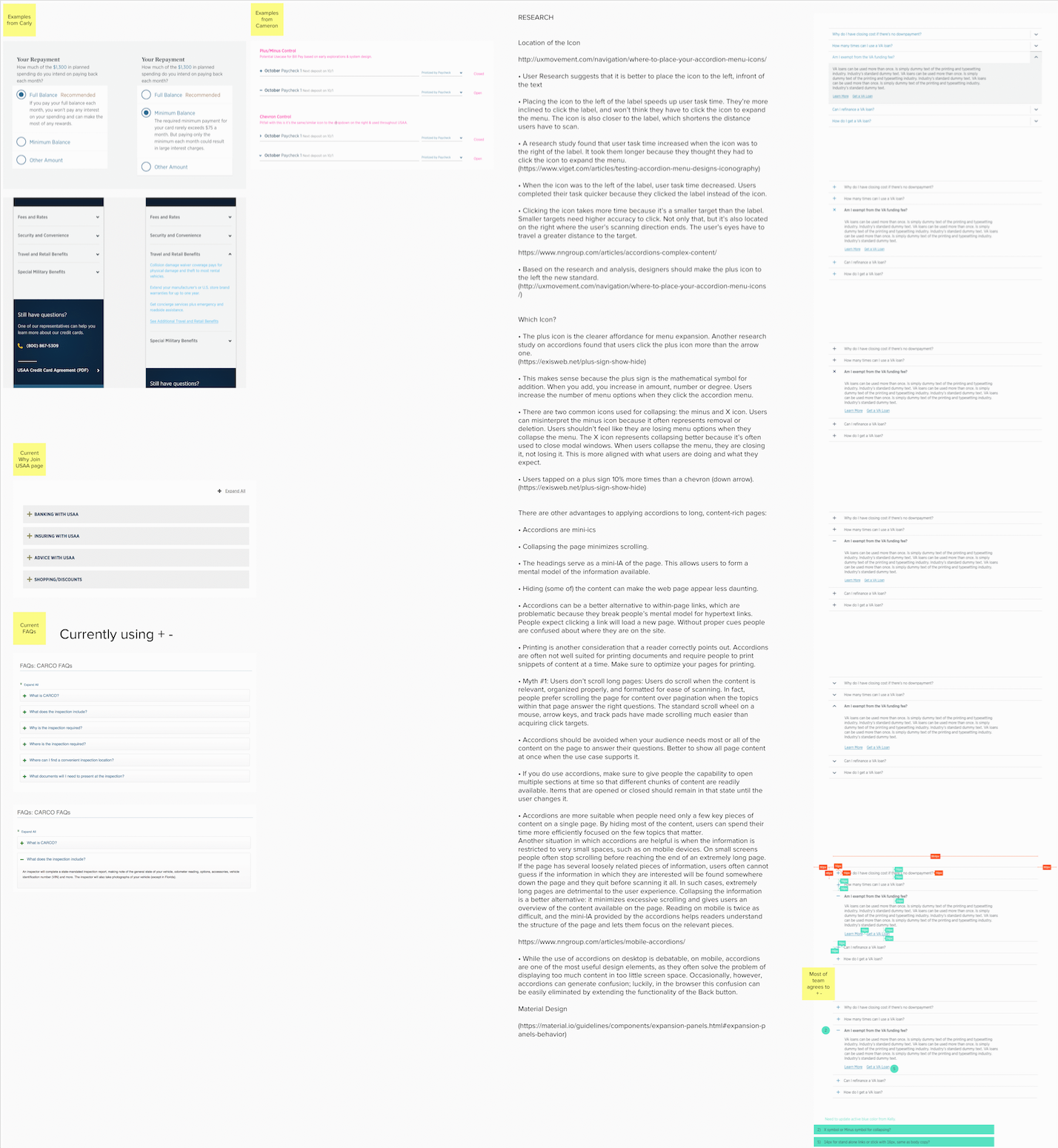
Some research and accessibility considerations for some previous projects
When I performed my research, I asked my users on what they need and expect of the components that I was building and also did extensive outside research, by searching the web for best practices. One of our biggest priorities was it to ensure that the color contrasts are always met, and that the font sizes are ADA compliant as well. To get a better view, please download the files.

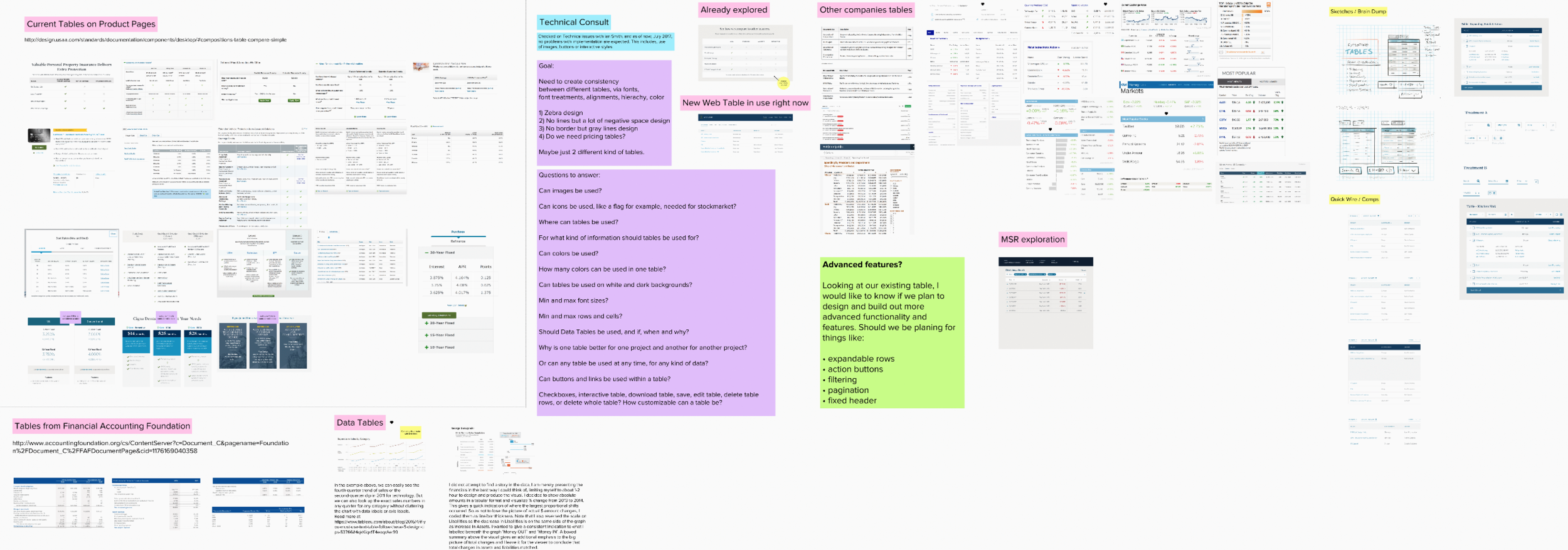
Table component research
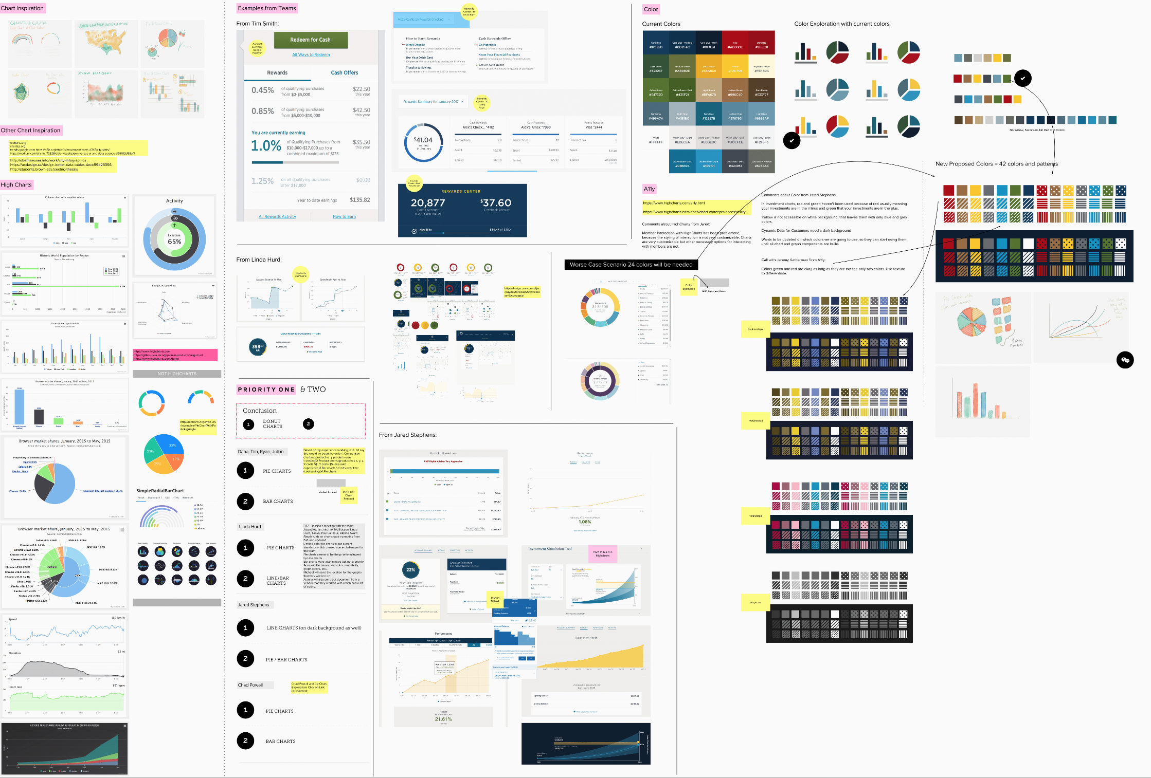
Charts and Graphs component
For the charts and graphs component the most important part was to ensure that they are ADA compliant. I came up with a color system that works for everyone, including people with vision impairments.