bauerhorst
UX UI Designer & Director
UX/UI design
Tabs (bound and unbound)
One of my recent tasks was it to re-design some bound and unbound tabs, as there was feedback to them being too large and to also align them to the 8px grid.
I first reached out to other design teams to hear from them what it is they need and to review with them any of their design solutions to tabs. Then I checked out the tab component on other websites and in other design ui kits. From there I created my unbound and bound tab solution. I build it all in Sketch, where each tab is a symbol that can easily be implemented and the text overrides make it easy and quick to use. I made a few short videos to show you how simple it is to build some tabs (see below).
The biggest update I made was to the unbound tabs. Before they didn't have a line that connected them and they seemed to just float on the page. There was some feedback that people didn't recognize them as tabs. I left aligned my unbound (as well as bound) tabs and added the 1px gray line. By adding the line we now draw a distinct separation between the tabs and the content below. The tabs don't seem to be floating on the page but seem anchored to the line right below them.
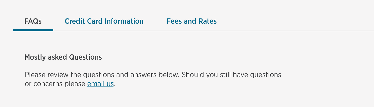
Unbound tabs
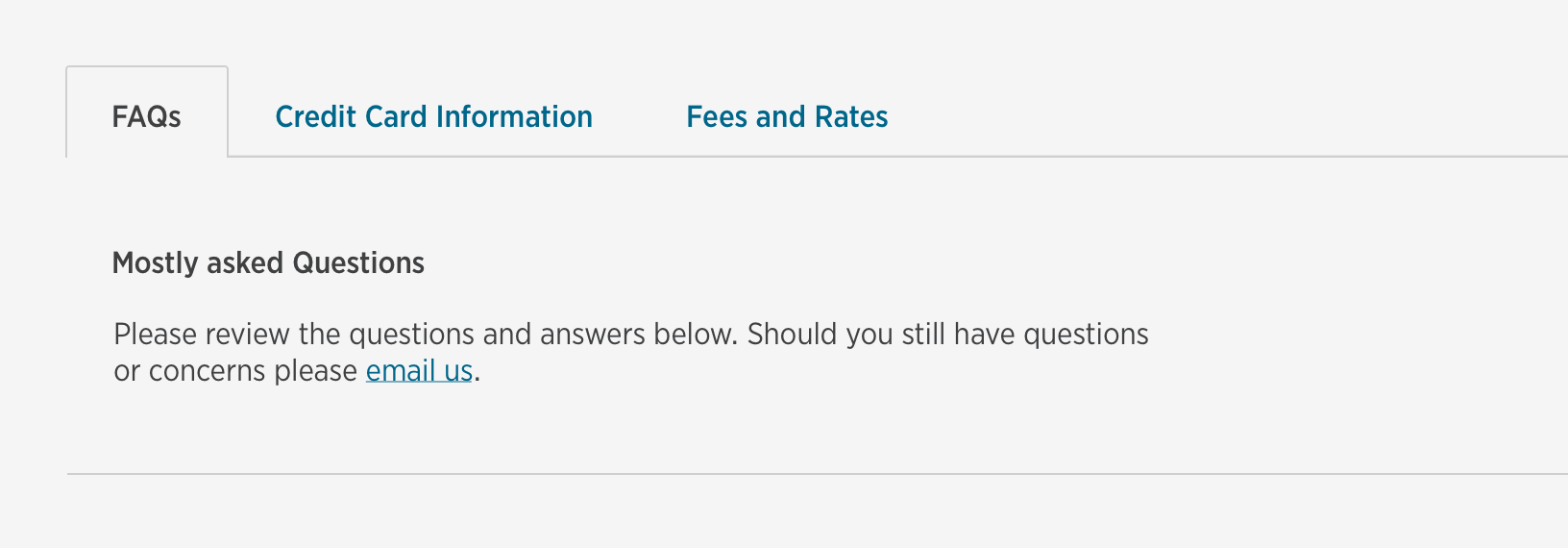
Bound tabs
Tabs on mobile

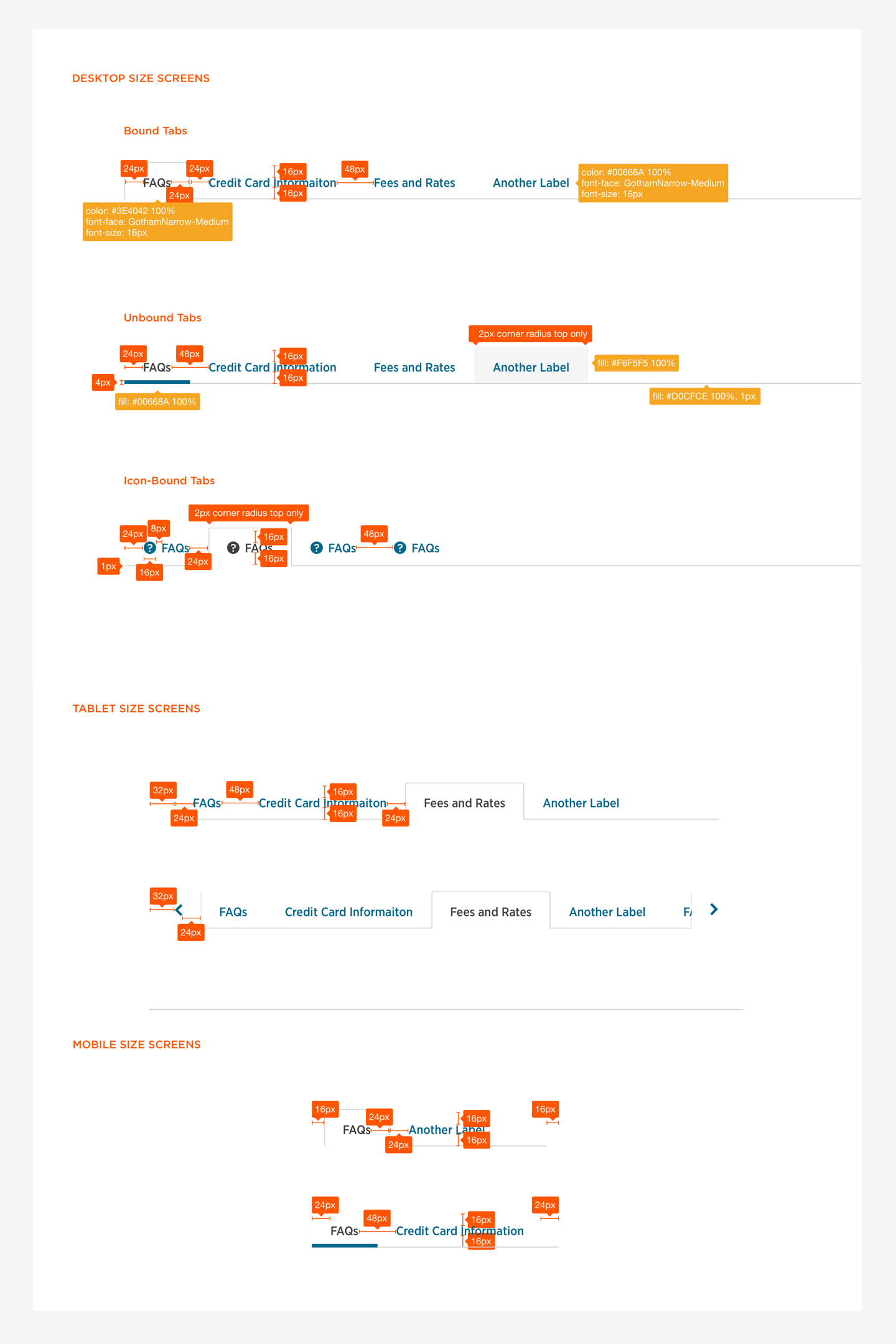
Redlines
How to videos
How to use the tab symbols via Sketch
How to adjust the tabs for different screens via Sketch