bauerhorst
UX UI Designer & Director
Tabs (bound and unbound)
One of my tasks was it to re-design some bound and unbound tabs, as there was feedback to them being too large and to also align them to the 8px grid.
I first reached out to other design teams to hear from them what it is they need and to review with them any of their design solutions to tabs. Then I checked out the tab component on other websites and in other design ui kits. From there I created my unbound and bound tab solution. I build it all in Sketch, where each tab is a symbol that can easily be implemented and the text overrides make it easy and quick to use. I made a few short videos to show you how simple it is to build some tabs (see below).
The biggest update I made was to the unbound tabs. Before they didn't have a line that connected them and they seemed to just float on the page. There was some feedback that people didn't recognize them as tabs. I left aligned my unbound (as well as bound) tabs and added the 1px gray line. By adding the line we now draw a distinct separation between the tabs and the content below. The tabs don't seem to be floating on the page but seem anchored to the line right below them.
Unbound tabs
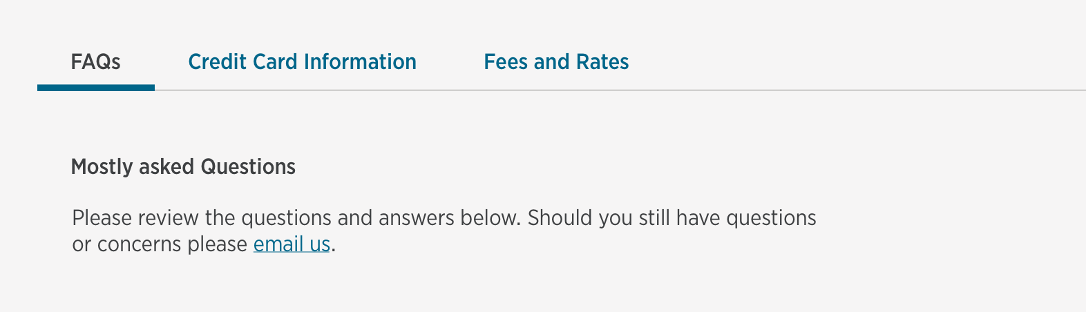
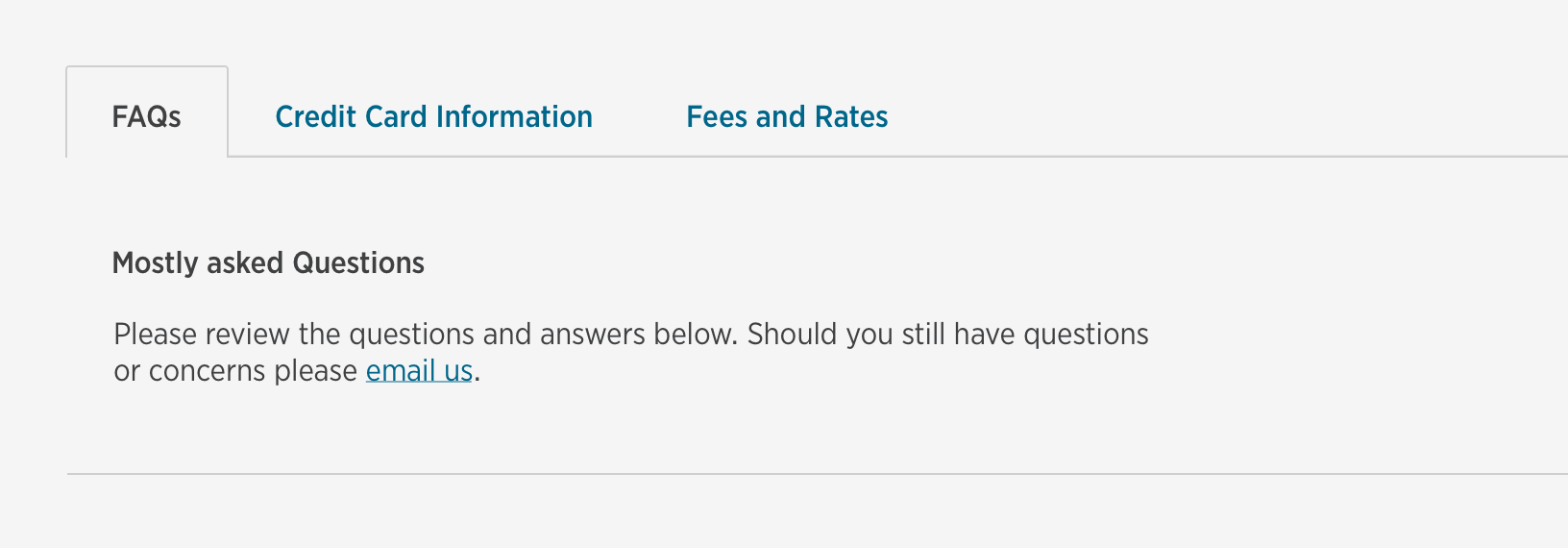
Bound tabs
Tabs on mobile

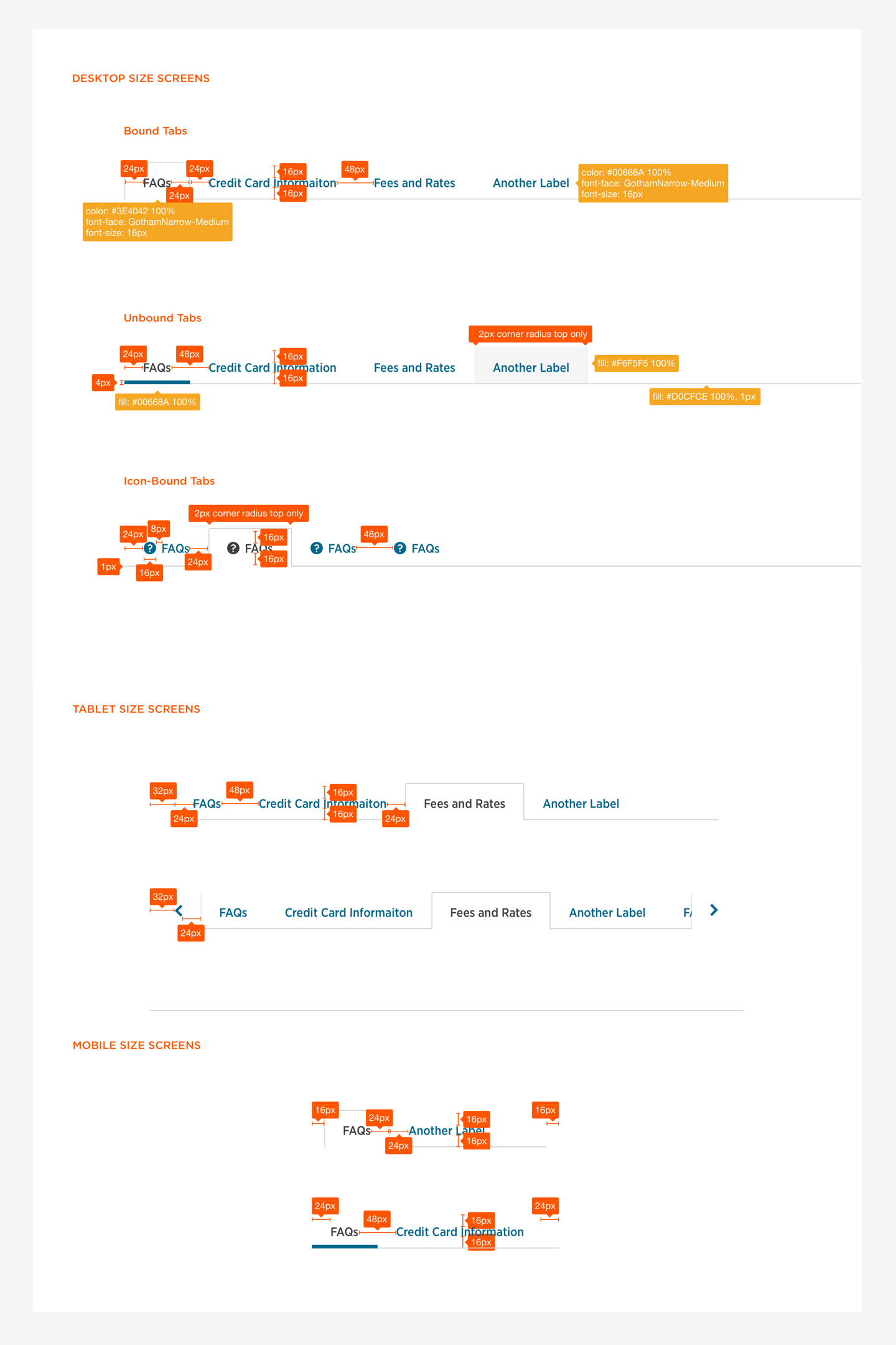
Redlines
Tabs rationale
Use tabs to organize and navigate among sets of content on the page.
Recommended usage
They should appear above their corresponding content.
Name the tab labels contextually to allow the user to easily discern what content appears beneath it. Tabs group content together, so use descriptive labels that describe the tab content.
Choose from Bound and Unbound Tabs based on your business or visual hierarchy needs.
Bound Tabs and Unbound Tabs can be used based on your products need.
Use tabs conservatively on the page. If tabs don’t fit horizontally on the desktop view, left and right arrows appear to make navigation to hidden tabs possible. This might not be the best user experience, so use this extended functionality with discretion.
On smaller screens the left and right navigation arrows will display.
On mobile the tabs can turn into an Expand/Collapse Menu or a Dropdown Menu if there are too many tabs to fit on the mobile screen.
On mobile devices Bound Tabs (only) need a 16px padding on the left and right.
Tabs should be placed horizontally in a single row. If vertical tabs are needed for your project, please reach out to the DLS team.
Not Recommended
Don't truncate or wrap a label name on to a second line.
A11y
Keyboard
Tabbing onto the tabs focuses the tab group, which operates as a single control.
Pressing the left and right arrow keys moves focus to the next or previous tab.
Moving to the next or previous tab updates the related tab content.
Pressing tab moves onto the next focusable element, leaving the tab group.
Screenreader
On focus of the tab group, the screen reader reads the currently selected tab title and number of tabs.
Pressing left and right arrow keys announces the previous and next title and number of tabs.
How to videos
Being part of the Design system team, it was important to educate the 300+ designers throughout USAA on how to use the components we created. Therefor I recorded step by step video tutorials for the designers.
How to use the tab symbols via Sketch
How to adjust the tabs for different screens via Sketch